getty
Creating a “Depth Chart” can help you see the field
Covid-19 temporarily put most professional sports on hiatus. When they came back, we were again treated to world-class athleticism, performed at speeds well beyond what most of us can do. But there is a lot that goes into that on-field product, behind the scenes.
It is not enough for a coach to just send the players out there to do their thing. And as a former coach myself (OK, it was only 10 years of Little League baseball), and a fan of organization and investment markets, I see the value of something called a “Depth Chart.”
What is a Depth Chart?
The Depth Chart is what organizes the team’s roster of players. It varies by sport, but generally speaking, it is divided as follows:
* Starting players at each position
* The first backup at each position
* The second backup at each position
* Others in the organization, but further down the list. These players are either younger and in development, or older and filling in spots as emergency replacements due to injury.
The Depth Chart keeps it all together, so that the organization can function smoothly, and move key pieces of the roster in and out. That allows them to always have the best players on the field.
The Investing Depth Chart
Investing is just like that! At least, if you are serious about it. Picking stocks based on whatever idea came to you today is like rolling the dice.
A better way to manage your portfolio and maintain a consistent “scouting” process for investments to occupy the portfolio is to do what sports teams do. Use a depth chart. This is the case whether you are investing professionally or on your own.
In the case of an investing depth chart, you aren’t looking for a starting Quarterback or your starting Catcher. The positions are up to you.
I have used Depth Charts in many forms over the years. As the markets evolve, the format of the Depth Chart has evolved with it. There was a time when my Depth Charts had many different types of stocks in different segments. These days, with so many stocks moving in sync, up and down, that is less of a priority.
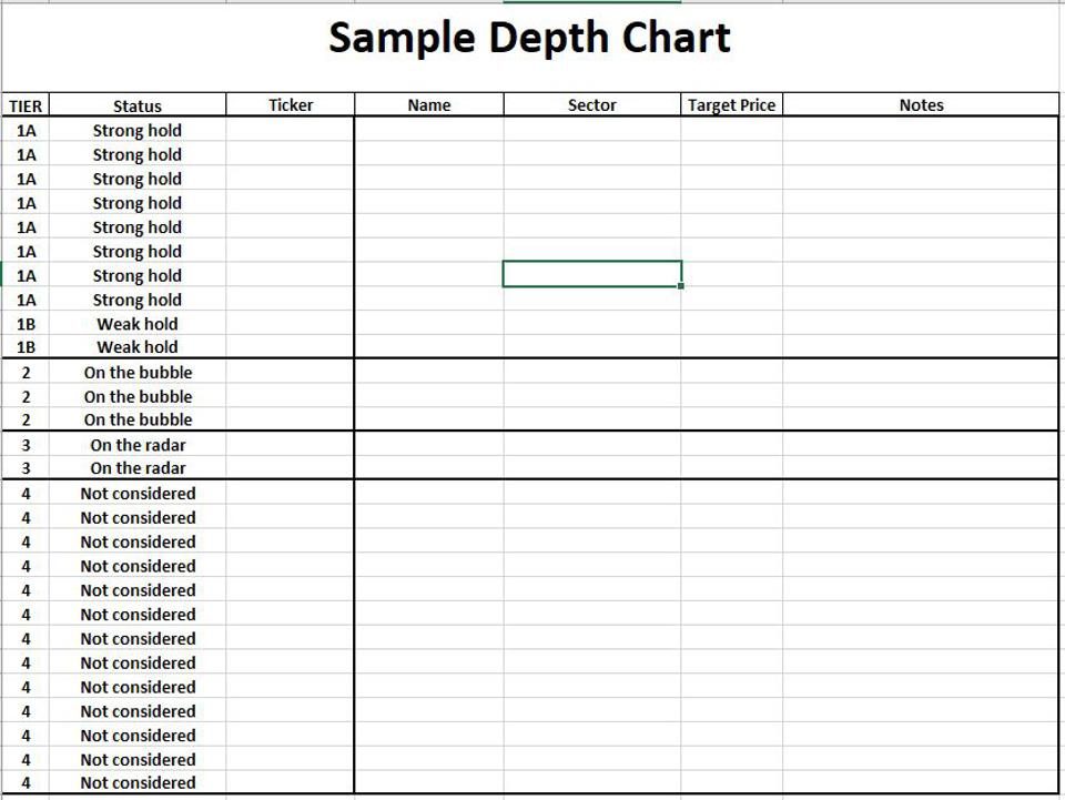
A sample depth chart
To illustrate the concept, here is a generic version of what this might look like. The securities are “tiered” vertically, according to investment attractiveness. I included some data columns that might be helpful. Depending on what data sources you access, you can fill in your favorite analytics, stats, etc.
Tier 1 securities are current holdings. 1A are not under serious consideration to be sold, but securities classified as 1B are.
What would replace them? Likely something from Tier 2, securities which are “On the Bubble.” In other words, they are on the verge of being “portfolio-worthy.” However, they are either not quite ready (in the opinion of the investor), or the portfolio is too full to let another security in. I have seen both extremes plenty of times: more attractive securities than slots available, and periods in which I did not come close to filling up the portfolio (i.e., nearly everything looked expensive to own).

The Hedged Investor (Rob Isbitts)
Tier 3 is the next level down. I refer to this here as “on the radar” because they have caught my eye, but it’s too early to give them immediate consideration. If they get closer, they can “graduate” to Tier 2.
Tier 4 is where the rest of the depth chart securities hang out. These have qualified to be considered, but are so far away from where they’d be priced well, they just sit on the list. A good example of how the status of a 4 can quickly change? If a stock misses earnings, the price falls heavily, and we surmise that the big decline is overdone, that could move it out of 4-territory fast, and up the list toward being a portfolio holding.
What types of securities go into a Depth Chart (mine, anyway)?
I start with 3 broad categories. These can be combined into one depth chart, or you can separate them out. Think of this as my answer to the old Stocks/Bonds/Cash mix, which I believe is seriously outdated.
Equity
This could be a group of 20-30 stocks that form the core of the portfolio. Or, we can easily substitute 1, 2 or 3 equity ETFs instead. These form the long-term nucleus of the portfolio.
Hedge
This category includes straight attempts at hedging the equity market, like single-inverse ETFs. But it is not entirely about defense. I have expanded it over the years to include a wide variety of lower-correlation styles.
Tactical
This segment is a fairly long list of sectors, industries, and anything that I’d prefer to “rent” instead of “own” in the portfolio. As I see it, they are best deployed as “bench players” I can move in and out of the lineup when I think they can help the team, er, portfolio.
The Depth Chart is a starting point. I think it’s a necessary one for serious investors. And with all of the technology we have at our fingertips, and the constant flow of data and investment information, its a lot to keep track of. Creating and maintaining your own investment Depth Chart can help.
Comments provided are informational only, not individual investment advice or recommendations. Rob Isbitts provides Advisory Services through Dynamic Wealth Advisors


